
SLDS 2 and the Cosmos Theme: What Breaks When You Flip the Switch
The five ways custom CSS breaks under Cosmos, the linter that finds them before your users do, and how Winter '27 group activation ends the all-or-nothing switch.
A sales manager asks for dark mode. You have seen it in a demo, you know Salesforce shipped it, so you open Setup, type Themes and Branding, and there it is: Salesforce Cosmos, sitting next to the theme your org has run since 2019. You activate it in a full sandbox to see what happens. Twenty minutes later the quoting component your team built three years ago is rendering grey text on a grey card, and the discount badge that used to be red has gone invisible.
Nothing in that component's JavaScript changed. Its markup is byte-for-byte identical. The CSS layer underneath it is what moved.
Cosmos is the first theme built on Salesforce Lightning Design System 2, and SLDS 2 rewrote the styling foundation beneath every base component on the platform. Salesforce describes this as a styling change rather than a functional one, which is accurate and also the reason it catches teams by surprise. Functional changes arrive with deprecation notices, a migration tool and a compatibility matrix. A styling change arrives as a picklist in Setup that any admin with Customize Application can change on a Tuesday afternoon.
Where this sits on the calendar
SLDS 2 themes became creatable in orgs in Spring '25 and went generally available in Winter '26. Cosmos shipped as the standard SLDS 2 theme. Dark mode, the feature Salesforce calls its most requested, went to beta in Winter '26 for Starter Edition and expanded in Spring '26 to Free Suite, Pro Suite, Professional, Enterprise and developer editions. Dark mode has one hard prerequisite: an SLDS 2 theme. There is no path to it that leaves you on SLDS 1.
Winter '27 is the release that changes the calculus. Pre-release orgs opened on August 13, the release notes publish on August 19, and sandbox preview opens at the end of the month, with production instances upgrading across three weekends from late August into October. Check Salesforce Trust for your specific instance rather than assuming, and if you have not mapped the rest of that release yet, the Winter '27 preview guide covers the changes landing alongside this one.
Two Winter '27 items matter here. Flow Builder picks up SLDS 2, which is the largest visual change to Flow Builder since it launched. And Salesforce is adding group-based SLDS 2 activation, so you can turn the new design system on for a segment of users instead of the entire org at once. That second one is the reason to do the audit work now instead of in December.
What SLDS 2 actually replaced
The mental model that helps: SLDS 1 gave you a styling surface plus a large, informally stable set of internal class names that everybody read as an API. SLDS 2 keeps the surface, formalises it, and takes the internals back.
That surface is styling hooks, which are CSS custom properties with semantic names. Global hooks carry the --slds-g- prefix and describe org-wide values like surface colors, border colors, radii and typography scale. Change one and every component that consumes it changes with you. That is the intended contact point between your CSS and the platform's, and it is the only one Salesforce commits to keeping stable.
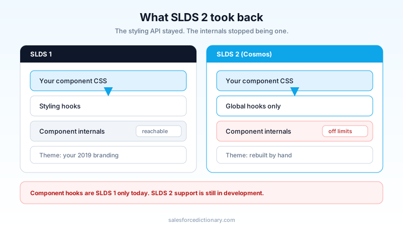
The layer that disappeared is the one nobody officially had. If a component's stylesheet reaches into .slds-button__icon or overrides a base component's internal markup with a descendant selector, that CSS worked because the internals happened to be shaped that way, not because the platform promised they would be. SLDS 2 reshuffled them. The Developer Guide is blunt about it: CSS overrides are unsupported because SLDS classes and base component internals can change in any release.
There is one gap in the styling API that will decide your rollout order. Component-level hooks, the --slds-c- family that lets you restyle a single base component, are supported in SLDS 1 only. SLDS 2 does not support them yet, and Salesforce's own guidance is that orgs whose custom components depend on component hooks should stay on SLDS 1 themes for now, because activating Cosmos can style those components incorrectly. Component hook support for SLDS 2 is in development with no published date.
That is not a footnote. If your LWC library restyles lightning-button or lightning-datatable through component hooks, and most mature libraries do, the flip to Cosmos is blocked on Salesforce, not on you. Knowing that today is worth more than finding it out in a preview sandbox in September. Teams who built a shared component layer, the kind of internal design library that usually grows alongside a state management pattern, will feel this hardest, because the restyling is centralised and so is the breakage.
The five ways custom CSS breaks
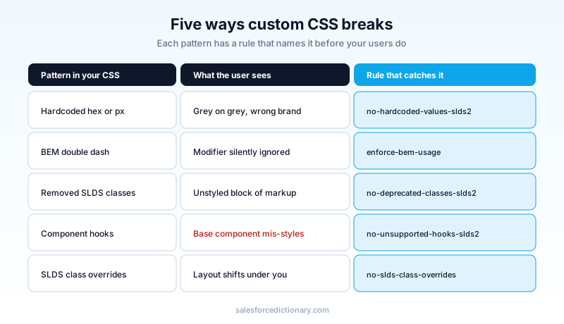
Every failure I have seen falls into one of five buckets, and each has a linter rule that names it.
Hardcoded values. A hex color, a pixel radius, a font size typed directly into a component stylesheet. It looked correct against SLDS 1 because you eyedropped it from the platform. Under Cosmos the surface behind it changed and your value did not, which is exactly how you get grey on grey. The no-hardcoded-values-slds2 rule catches these, including px-to-rem conversion, and it now checks the line-height property too.
BEM double-dash class names. SLDS retired the -- modifier syntax in favour of a single underscore. slds-button--brand still resolves in places and will not survive. enforce-bem-usage flags every one.
Classes that no longer exist in SLDS 2. Utility and blueprint classes were removed or renamed. no-deprecated-classes-slds2 reports them, and as of linter 1.2.0 in February 2026 it scans CSS files as well as HTML, which matters because half of these live in stylesheets, not markup.
Component styling hooks. enforce-component-hook-naming-convention and no-unsupported-hooks-slds2 between them will tell you which hooks are deprecated by name and which have no SLDS 2 equivalent at all. Also in this bucket: --lwc- design tokens, the generation before styling hooks, caught by lwc-token-to-slds-hook.
Reaching into internals. no-slds-class-overrides flags CSS that terminates a selector on an SLDS class, which is the pattern that says "I am styling somebody else's markup". Its frequent companion is no-important-tag, because !important is usually the tell that a previous developer already lost this fight once.
There is a sixth category the linter cannot help with, and it is the one that produces the worst support tickets. Global styling hooks are not supported everywhere. Toasts raised through lightning/platformShowToastEvent, tooltips inside lightning-helptext, links in breadcrumbs and formatted components, and form elements including inputs, checkboxes, radio groups and textareas all sit outside the reach of global hooks today. If your brand depends on those surfaces matching, write that down as a known gap before anyone signs off on the rollout.
Run the linter before you touch the theme
The tooling is genuinely good, which is not something I say about every migration aid Salesforce ships. SLDS Linter is a CLI, it needs no org connection, and it runs against your source in about the time it takes to read this paragraph.
# scan the whole source tree
npx @salesforce-ux/slds-linter@latest lint force-app

# machine-readable output for triage or CI
npx @salesforce-ux/slds-linter@latest report -d force-app -o reports
Three commands: lint, report, and emit for dumping the config files so you can commit and tune them. --fix auto-corrects the mechanical categories, which realistically means the BEM renames and a decent share of the hook substitutions. The report is SARIF, so it drops straight into a code-scanning view rather than a text file nobody reads.
Version 0.5.0 in August 2025 moved the rule set from Stylelint to ESLint 9 with flat config support, keeping ESLint 8 working. If your repo already has an ESLint pipeline, the linter joins it rather than sitting beside it. There is also the SLDS Validator extension for VS Code if you would rather see the warnings inline while writing the component, and both tools describe the same rule set.
A pattern that works: run the linter once with no filters, sort the findings by rule, and fix by rule rather than by file. Every enforce-bem-usage hit in the codebase is the same edit, so batch them, review one diff, and move on. Fixing file by file means re-learning the same rule twenty times.
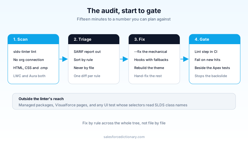
Then wire it into CI. The value of this work decays fast if the next sprint adds fresh hardcoded hex values, and a red build is the cheapest way to stop that. Teams already running a Salesforce DX pipeline can add the lint step next to the Apex tests without much ceremony.
Fix the source of truth, not the symptom. The replacement pattern the linter proposes is a hook with a fallback:
/* before: three findings from no-hardcoded-values-slds2 */
.quote-card {
  background-color: #ffffff;
  border: 1px solid #dddbda;
  color: #080707;
}

/* after: the hook the linter names, with the old value as fallback */
.quote-card {
  background-color: var(--slds-g-color-surface-container-1, #ffffff);
  border: 1px solid var(--slds-g-color-border-base-1, #dddbda);
  color: var(--slds-g-color-on-surface-1, #080707);
}
The fallback is not optional politeness. no-slds-var-without-fallback exists because a hook that resolves to nothing renders as nothing, and a component that renders as nothing is harder to debug than one that renders in the wrong color.
What you cannot fix
Some of your org will not follow you to SLDS 2, and planning around that is more useful than fighting it.
Visualforce pages are not supported. Neither is Salesforce Classic, Tableau, or Slack. Setup and CRM Analytics continue rendering in SLDS 1 even with Cosmos active across the org, so the first thing a curious admin does after the switch, open Setup, is also the surface that will look unchanged and make them think the flip did not work.
Background colors and background images are gone from SLDS 2 themes, removed for accessibility rather than by oversight. If your current branded theme rests on a background image, there is no equivalent to migrate to. Existing SLDS 1 custom themes do not convert either. You rebuild them by hand in Themes and Branding against the new controls, which Summer '26 expanded to cover typography, shadows, sizing, spacing and illustration color, with inline previews so you are not guessing.
Then there is everything you did not write. Every managed package in the org styles itself, and you cannot lint code you cannot read. The practical move is to list your installed packages, check each vendor's stated SLDS 2 position, and treat silence as unready. An Aura component from a package that has not shipped an update since 2024 is not going to render correctly by luck.
Old Aura in your own codebase deserves the same scrutiny. The linter covers Aura .cmp and .css files as well as LWC, but Aura components tend to be the oldest code in the org and therefore the densest concentration of hardcoded values and internal-class selectors. If part of your team is newer to the modern component model, the first-component walkthrough is a reasonable place to start them, because the styling conventions they learn there are the ones that survive this migration.
The rollout, and why Winter '27 changes it
Here is the sharp edge in the current model: activation is org-wide, and so is the rollback. Switching back to an SLDS 1 theme deactivates SLDS 2 for every user at once. There is no per-profile, per-app or per-user escape hatch today, which means the blast radius of a bad flip is your entire user base and the fix is a full reversal for everyone including the people it was working fine for.
That is why the sane sequence has always been sandbox first. Activate Cosmos in a full or partial copy sandbox with representative data, walk the record pages that carry your custom components, and pay particular attention to anything built in Lightning App Builder where a custom component sits next to standard ones and any color drift is immediately visible side by side. Include your UI automation suite in that pass: selectors written against SLDS class names are as fragile as stylesheets written against them.
Winter '27's group-based activation is the piece that has been missing. Turning SLDS 2 on for a segment of users means you can run a real pilot: one team, two weeks, actual work rather than a scripted click-through, with the rest of the org untouched. Salesforce built it in response to enterprise customers asking for exactly this, and it converts a one-way-ish door into a normal staged rollout.
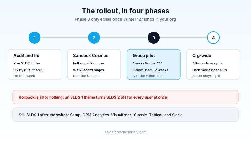
Sequence the pilot group deliberately. Pick users whose daily work covers your custom components rather than the volunteers who like new things, because enthusiastic testers report opinions and heavy users report bugs. Give it a full close cycle if your org has one. Month-end is when the obscure Visualforce page nobody mentioned in discovery finally gets opened.
Dark mode is the ask, SLDS 2 is the bill
Most orgs will not schedule this work because a design system moved. They will schedule it because someone asks for dark mode and dark mode requires SLDS 2, and once you are there you own the whole migration.
Set expectations early on that one. Setup pages are not currently styled for dark mode, and neither are the builders, Flow Builder included. Related lists can flash white while a page loads. Users toggle their preference from the profile menu between light, dark and system, and the theme has to have dark mode enabled on it in Themes and Branding first. A user who was promised dark mode and gets a dark record page framed by a bright white Setup menu will file that as a bug, so tell them the shape of it up front.
The honest summary: for an org that stayed close to platform conventions, this is closer to a flip than a rebuild, and Salesforce's framing is fair. For an org with a decade of custom components, three acquisitions worth of managed packages and a stylesheet somebody wrote against .slds-form-element__label in 2019, it is a real project, and the size of it is knowable today for the price of one linter run.
Run the linter against your source this week and count the findings by rule. That number, not a vendor timeline, tells you whether Cosmos is a sandbox afternoon or a Q4 workstream, and it costs you fifteen minutes to get it. Then check your component hook usage, because if it is heavy, the answer for now is to fix everything else and wait for Salesforce to close that gap.
About the Author
Dipojjal Chakrabarti is a B2C Solution Architect with 29 Salesforce certifications and over 13 years in the Salesforce ecosystem. He writes and edits salesforcedictionary.com, published by KineticBit Inc., to help admins, developers, architects, and cert/interview candidates sharpen their fundamentals. More about Dipojjal.
Share this article
Sources
Related dictionary terms
Practise it
Five questions on Platform Developer I
Exam-style questions with an explanation after each one. No account needed, and your answers build a weak-topic map once you have one.
Keep reading
Lightning Web Components (LWC) for Beginners: Build Your First Component in 30 Minutes
A complete LWC tutorial. What it is, why it replaced Aura, environment setup, Hello World, reactive properties, @wire to Apex, events, and the cache gotchas that trip up beginners.

Salesforce LWC State Managers: The Complete 2026 Guide
State Managers went GA in Summer '26 and change how Lightning Web Components share data. Here is how defineState, atoms, and fromContext replace prop drilling and event chains, plus the rules for when to actually use them.

Salesforce Winter '27 Release: Dates, Sandbox Preview, and the Updates That Will Break Things
Winter '27 hits sandboxes around August 29, 2026, and it retires the OAuth Username-Password flow for good. The dates, the preview mechanics, and a one-week prep plan.
Comments
No comments yet. Start the conversation.
Sign in to join the discussion. Your account works across every page.