
Dashboard
A Dashboard is a Salesforce page that displays the results of several reports as visual components: charts, gauges, metrics, and tables arranged on one screen.
Definition
A Dashboard is a Salesforce page that displays the results of several reports as visual components: charts, gauges, metrics, and tables arranged on one screen. Each component reads from exactly one source report and renders a slice of what that report returns.
The Metadata API models it as the Dashboard type, with a title, a folder, a running user, and a set of components laid out on a grid. Filters defined on the dashboard apply across those components.
Dashboards render cached results rather than live queries. The numbers on screen came from the last refresh, which is why every dashboard carries an "as of" date and time. The reporting logic lives in the reports underneath. The dashboard controls presentation, filtering, and whose access is used to produce the figures.
In plain English
“Think of a school report card. Teachers do all the marking. The card just collects the results in one place, so your parents can see how you are doing at a glance. A dashboard does the same job for a company. Other people's work gets gathered into one page of pictures and numbers.”
Worked example
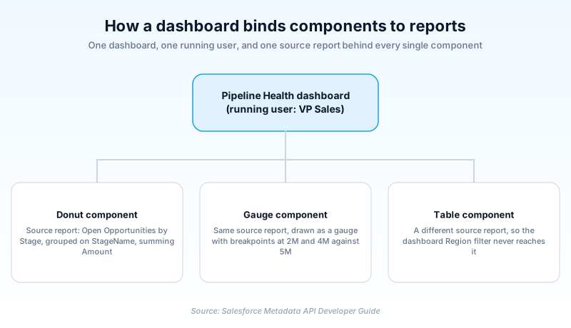
A regional sales director at a 300-seat distributor opens the Pipeline Health dashboard on Monday morning. The first component is a donut chart built on a report called Open Opportunities by Stage, grouped on StageName and summing Amount. Beside it sits a gauge on that same report, with breakpoints at 2,000,000 and 4,000,000 against a 5,000,000 target. A dashboard filter on Type offers New Business and Existing Business, and switching to New Business redraws both components. The running user is set to the VP of Sales, so every rep who opens the page sees full regional pipeline rather than only their own deals. The header reads "As of Today at 6:00 AM", which is when the scheduled refresh last ran.
How a dashboard assembles its numbers
Every component is tied to exactly one report
The binding between a component and its report is one to one, and it is not negotiable. A component cannot join two reports, and it cannot calculate anything the source report does not already produce. Want revenue by region sitting alongside headcount by region in one chart? The report has to return both, which usually means a custom report type. This is the first surprise for anyone arriving from other BI tools, where a chart queries whatever it likes. In Salesforce the report is the query layer and the component is a rendering of it. Groupings become axes, summary formulas become measures, and anything you left out of the report is simply unavailable at the dashboard level. Build and validate the report first. A component pointed at a sloppy report inherits every one of its problems, quietly.
Running user decides whose figures everyone sees
The Metadata API exposes this as dashboardType, with three values. SpecifiedUser runs the source reports as one named person, so all viewers see identical numbers at that person's access level. LoggedInUser runs them as whoever opened the page, producing a different result per viewer. MyTeamUser scopes data to users below the viewer in the role hierarchy, and has been available since API version 20.0. Picking SpecifiedUser is a data exposure decision, not a display preference. Point it at a system administrator and you have published that administrator's view of every record to anyone who can open the folder. Point it at a regional director and viewers outside that region read totals they could never reach through any other route. The runningUser field carries the whole access story for a dashboard, and almost nobody reviews it after go-live.
Filters cascade, but only where the field exists
A dashboard filter is defined once and applied across components, modeled as DashboardFilter and DashboardFilterOption in the metadata. Each option carries an operator (equals, notEqual, lessThan, greaterThan, contains, and others) plus one or more values. The catch is that a filter only reaches a component whose source report actually contains the field being filtered. Mix reports built on different objects and you end up with a page where three components respond to Region and two ignore it entirely. Nothing warns you. The two unaffected components keep showing org-wide totals next to filtered ones. Nobody reading the page can tell which is which. Line the field up across every source report before you add the filter, or split the content into two dashboards.
Cached results and the timestamp people skip
Opening a dashboard does not query records. It renders whatever was stored at the last refresh, which is why the header shows a date and time instead of "now". A refresh re-runs every source report behind the page, so a twelve component dashboard is twelve report executions. Two separate ceilings govern how often that can happen, and people mix them up constantly. Scheduled refreshes draw on a per-edition allocation, documented on the Reports and Dashboards limits page. Salesforce also asks for at least a minute between refreshes of the same dashboard. The Reports and Dashboards REST API carries a separate set of allocations, and only code calling that API draws on them. Its Requirements and Limitations page lists 200 dashboard refresh requests per hour and 5,000 dashboard results requests per hour. Report runs sit in that same API allocation: 500 synchronous runs per hour, 20 at a time. Scheduling a dashboard in the UI spends none of that. An integration polling dashboards on a timer spends all of it. Stagger the schedules and keep them away from peak hours.
Grid layout replaced the three column dashboard
Older dashboards stack components into leftSection, middleSection, and rightSection. Each section carries a required columnSize of Narrow, Medium or Wide, and that is the whole layout vocabulary. Lightning dashboards use dashboardGridLayout instead, available since API version 35.0, where you set numberOfColumns and a rowHeight in pixels and place each component on the grid. Components can span multiple columns and rows, so one wide trend chart can sit above four narrow metrics. This matters more than it sounds. The old three column shape forced every dashboard into the same rhythm, and reading order fought the layout constantly. With a grid you can put the number an executive opens the page for in the top left, at double width. Supporting detail goes below it.
Folder access comes before anything else
A dashboard lives in a folder, and folder access decides whether someone can open it at all. Sharing a dashboard means sharing its folder, at viewer, editor, or manager access. Viewers open and refresh. Editors change the layout and repoint components at other reports, and managers also decide who else gets in. That is a separate permission system from record sharing, and the two never consult each other. Withhold folder access and a user sees nothing, even if they own every record feeding the page. Move a dashboard into a different folder and you have quietly changed its audience without touching the dashboard itself.
Salesforce dashboards are not CRM Analytics dashboards
Two different products use the word dashboard and they share almost nothing. The one described here is the core platform surface, built from Salesforce reports in the Lightning Dashboard Builder and covered by the Reports and Dashboards REST API. CRM Analytics dashboards are a separate product with their own datasets, their own query language, and their own REST API. They handle data volumes and joins the core reporting engine cannot, and they are licensed on top of your existing edition. When a job posting or an implementation plan says dashboard, work out which one is meant before you estimate anything. The skills barely overlap, and neither do the licenses.
Where dashboards quietly go wrong
The most common failure is a page nobody trusts. It usually starts with one component whose source report carries a filter the title never mentions. The figure is correct, but it means something narrower than the label suggests. Second is sprawl. Salesforce allows 25 widgets per dashboard, of which at most 20 can be charts and tables. A page sitting at that ceiling has usually stopped answering any single question. Third is a stale running user, typically someone who left the company and whose access was reduced on the way out. Numbers drop overnight and half the org assumes the business collapsed. Audit the running user whenever a person named on a dashboard changes role. Rename components to match what the report actually filters on, and delete anything nobody has opened in a quarter.
How organizations use Dashboard
Sales managers open one pipeline dashboard each Monday, filtered by region. The running user is a sales operations account, so every manager reads the same totals.
Program directors track grant spend against budget, with every component reading from one custom report type that spans Opportunity and a custom Grant object.
A queue health dashboard refreshes on a schedule during off-peak hours, showing open cases by priority, average case age, and first response misses against target.
One utilization dashboard runs as the logged-in user. Each consultant sees their own billable hours, with no separate dashboard per person.
Trust & references
Cross-checked against the following references.
- Dashboard | Metadata API Developer Guide (opens in new tab)Salesforce
- Requirements and Limitations | Salesforce Reports and Dashboards REST API Developer Guide (opens in new tab)Salesforce
- Reports and Dashboards Limits and Allocations (opens in new tab)Salesforce
- Overview | Salesforce Reports and Dashboards REST API Developer Guide (opens in new tab)Salesforce
- Dashboards List Resource | CRM Analytics REST API Developer Guide (opens in new tab)Salesforce
Straight from the source - Salesforce's reference material on Dashboard.
Hands-on resources to go deeper on Dashboard.
About the Author
Dipojjal Chakrabarti is a B2C Solution Architect with 29 Salesforce certifications and over 13 years in the Salesforce ecosystem. He writes and edits salesforcedictionary.com, published by KineticBit Inc., to help admins, developers, architects, and cert/interview candidates sharpen their fundamentals. More about Dipojjal.
Test your knowledge
+5 pts / dayQ1. How many source reports can a single Salesforce dashboard component read from?
Q2. Which dashboardType value makes each viewer see data at their own access level?
Q3. You add a dashboard filter on Region. What happens to a component whose source report has no Region field?
Q4. Why does a Salesforce dashboard display an "as of" date and time?
Q5. Which setting determines whether a user can open a given dashboard at all?
Discussion
Loading discussion…